Flight Graph
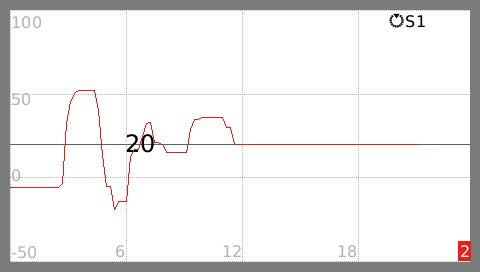
The flight graph will show the telemetry source chosen in a graph that will get rescaled every time the flight time exceeds the current timeframe shown in the graph.
A horizontal line with the current value is shown to facilitate quick interpretation of the graph, useful when flying, or for small widgets.
The telemetry value can be scaled.
100 means it will be scaled to 100% (no scaling).
A stick or switch source will then range between -1024 and 1024.
Using a scale of 1024 means that a stick or switch source will be scaled to (value/1024 * 100), so they will range beteween -100 and + 100.
Practical tip to view the graph while flying and not loosing sight of your plane is to keep the arms straight, end hold the transmitter in the air to be next to your plane.
Now you can quickly switch between the screen and the plane, without to much a risk of loosing sight on the plane.
In the Help screen you can set the task timer and the flight timer. As soon as both the flight timer and start timer start counting down, a new graph is started showing the selected source during the flight. When the flight timer is reset, and starts counting down again, a new graph is started.
When timer 3 is selected as a flight timer, the 'enter' button will trigger the new graph.
When timer 3 is selected as task timer, the 'enter' button will trigger a new task.
The plus and minus buttons can be used at any time to switch between the previous graphs in the task and the current graph.
A small indicator in the lower right corner tells you which graph is shown.